-
Your shopping cart is empty!
Your shopping cart is empty!
This time of year is the beginning of the wedding season and we are busy supplying paper lanterns to wedding venues all over the country. What are the trends for this summer’s weddings?
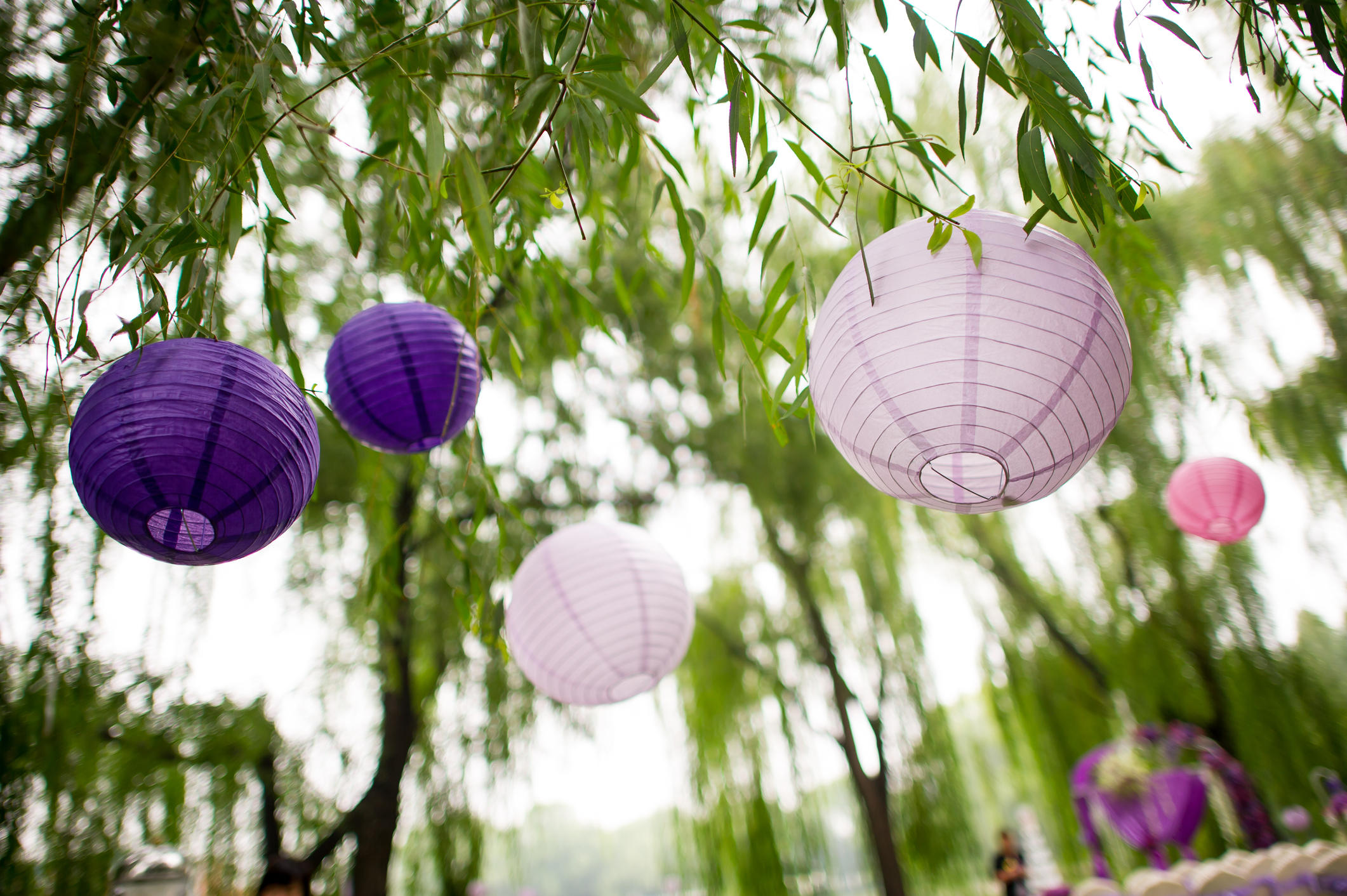
We like to look at the Pantone colour of the year for inspiration and this year they have chosen two lovely pastel shades, Rose Quartz and Serenity (http://www.pantone.com/color-of-the-year-2016) which blend together to produce a range of soft rose-blue-lilac shades. If you are inspired by these gentle shades then our pink, lavender and arctic blue paper lanterns will look perfect together.
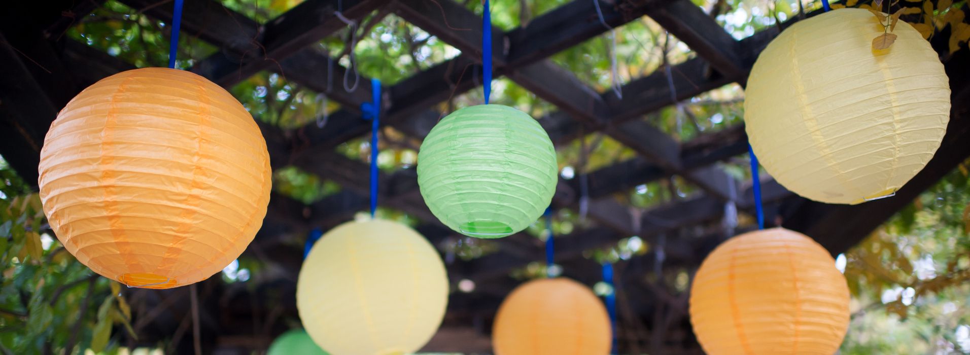
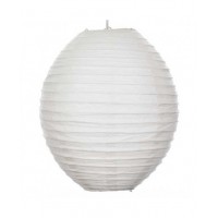
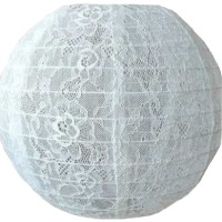
You have the choice of buying pastel party packs of 12 mixed shades in various sizes - 8 ins, 12 ins and 16 ins. See the full Wedding range or creating a unique colour combination yourself and ordering just the colours you love.
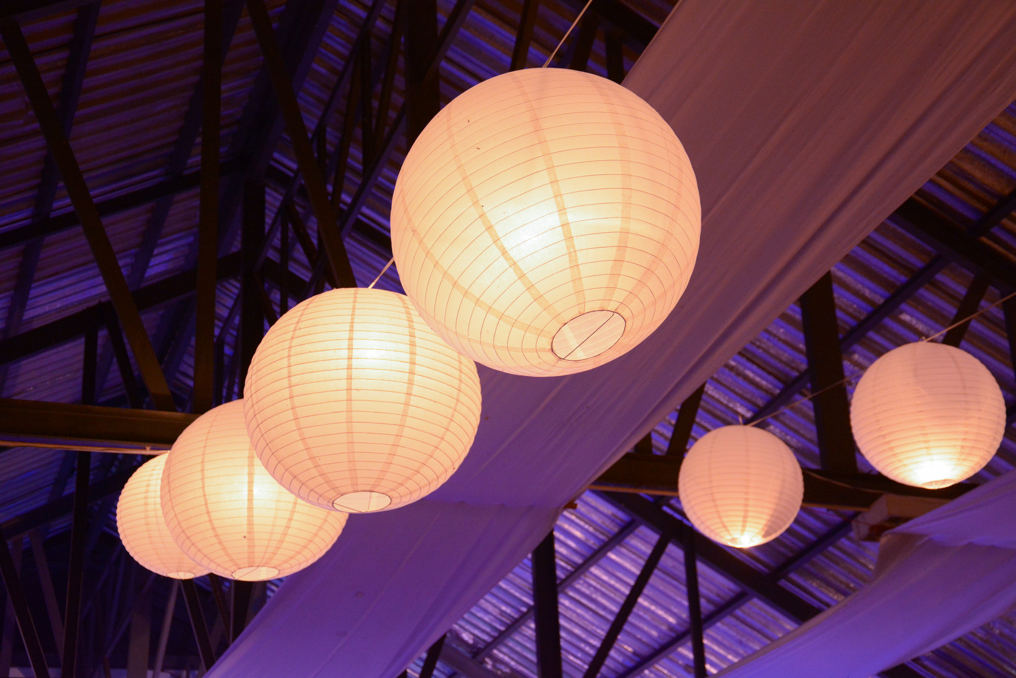
Things to consider when choosing paper lanterns for your wedding venue:
1. The decoration and style of the room.
2. The height of the ceiling or roof of the marquee. For a tall room or marquee larger lanterns will make a better impact.
3. The colour of the marquee lining. Most linings are white or ivory, so consider a coloured paper lanterns as a contrast so that they stand out against the fabric.
4. The overall theme of the table settings, chair coverings and floral displays.
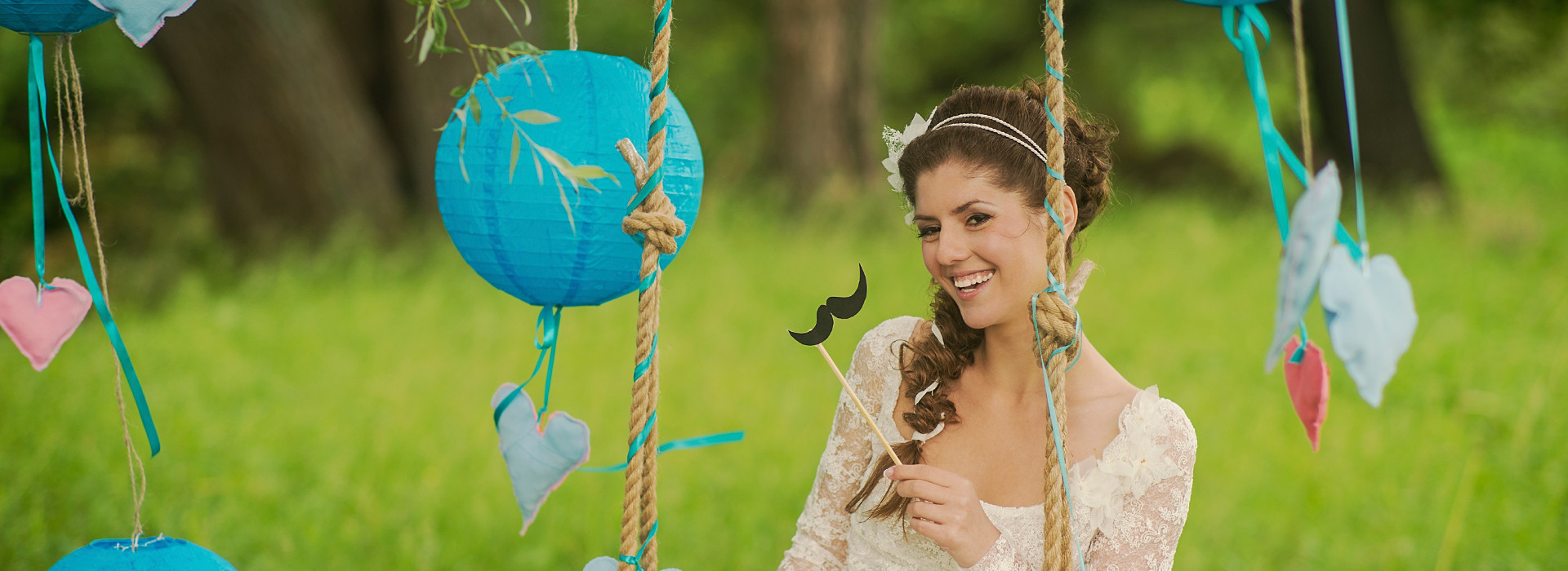
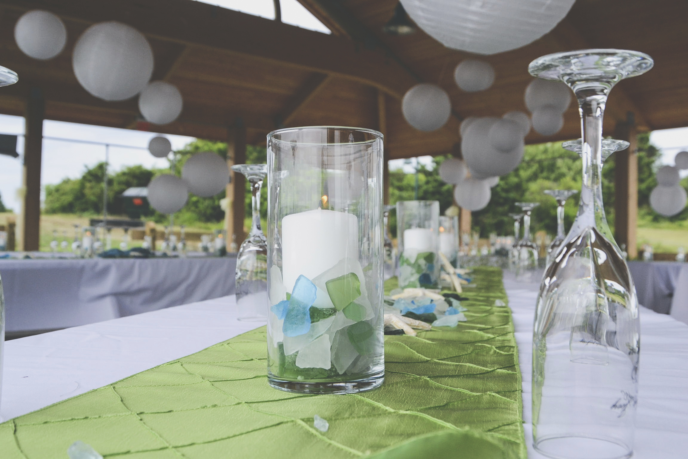
One of our customers, CZ Handsaker Floral Designs, recently selected sunshine yellow, white and aqua coloured paper lanterns to complement their table decorations as you can see in the picture below.
For help in selecting the right combination of paper lanterns for your wedding venue, please do not hesitate to get in touch.

-55x55.JPG)